Visualization - Line - Line
Jump to navigation
Jump to search
A Line Chart displays information as a series of data points (markers) connected by straight lines. It is a common chart and especially useful when analyzing time-series data.
Examples
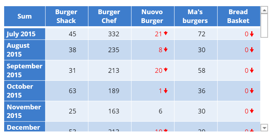
The examples below use data from a fast-food consumption survey. The first visualization shows the popularity of a single chain, while the second compares data from multiple chains. The process of creating the two visualizations is the same; the difference is how the tables are set up.
Single-line Chart
Multiple-line Chart
 |
Create a Line Chart in Displayr
- 1. Go to Insert > Visualization > Line Chart
- 2. Under Inputs > DATA SOURCE > Output in ‘Pages’, select your table from the dropdown menu
Object Inspector Options
The following is an explanation of the options available in the Object Inspector for this specific visualization. Refer to Visualization Options for general chart formatting options.
Chart
- Data Series
- Line shape Controls the shape of the lines. When the line shape is set to Curved, spline interpolation is used to smooth the lines between data points.
- Line type can be one of "Solid", "Dot" or "Dash".
- Line thickness Thickness of the lines in pixels. When there are multiple data series in the chart, a comma-separated list of values can be used instead of a single numeric value. Values will be recycled if there are fewer values than the number of data series.
- Show markers on line If selected, markers will be placed at the specific data points. The colors of the markers are set to be same as the as the data series, but the marker symbol and marker size can be adjusted.
- Show markers at end points only If selected, markers will be placed at the first and last data point in each series.
- Show data labels at end points only If selected, data labels will be placed at the first and last data point in each series. If this checkbox is selected, it will also be applied to annotations added to the data labels.
More Information
Code
{
    "formChartType": "Line",
    "formStackSeries": false,
    "formSmallMultiples": false,
    "formAsPercentages": false,
    "formScatterLabelType": "As hover text"
}