Visualization - Geographic Map - Small Multiples Geographic Map
Jump to navigation
Jump to search
The Small Multiples - Geographic Map feature creates a panel of choropleths charts. It is a particularly useful way to visualize how a country, state, or region has changed over time.
Example
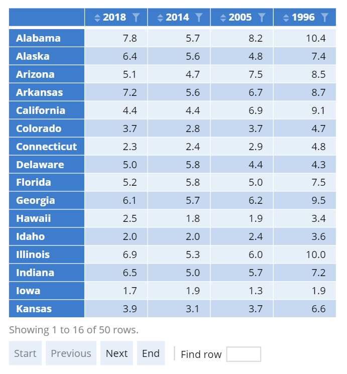
The example below visualizes the homicide rate for US states over time. The geographic maps are created using the following table. The small multiples feature takes data from every column and creates a separate panel for each year.
 |
Create a Small Multiples Geographic Map in Displayr
- 1. Go to Insert > Visualization > Small multiples > Geographic Map
- 2. Under Inputs > DATA SOURCE > Output in ‘Pages’, select your table from the dropdown menu
Object Inspector Options
The following is an explanation of the options available in the Object Inspector for this specific visualization. Refer to Visualization Options for general chart formatting options.
More Information
Code
{
    "formChartType": "Geographic Map",
    "formStackSeries": false,
    "formSmallMultiples": true,
    "formAsPercentages": false,
    "formScatterLabelType": "As hover text"
}