Visualization - Bar - Funnel
Funnel charts (also known as <span data-content="synonym"pyramid charts charts and wedding cakes) are variants of the bar chart. The charts often appear in the shape of a triangle to depict the hierarchy or step-by-step change in the data.
Example
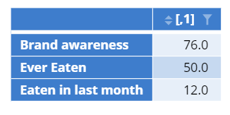
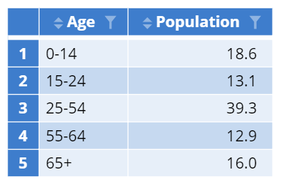
The most common way to input data into a pyramid chart is through a table, where the first column represents the label and the second represents the value.
The following example is a brand funnel for a fast-food chain. The visualization tracks the change in each stage of the funnel.
The next example is a pyramid chart that is not necessarily shaped like a triangle. The visualization is a population pyramid of the United States in 2017.
Create a Pyramid Chart in Displayr
- 1. Go to Insert > Visualization > Pyramid Chart
- 2. Under Inputs > DATA SOURCE > Output in ‘Pages’, select the table you want to visualize.
- Note: if your variables are structured as binary variables, you can select them in Inputs > DATA SOURCE > Variables in ‘Data’ instead of creating a table
Object Inspector Options
The following is an explanation of the options available in the Object Inspector for this specific visualization. Refer to Visualization Options for general chart formatting options.
More Information
Code
{
    "formChartType": "Funnel",
    "formStackSeries": false,
    "formSmallMultiples": false,
    "formAsPercentages": false,
    "formScatterLabelType": "As hover text"
}

