R GUI Controls
Overview
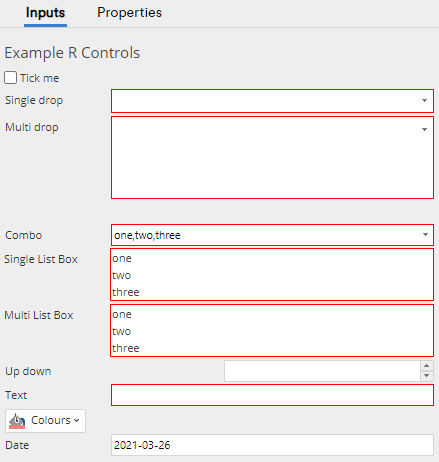
Standard R Pages provide the user with controls on the Inputs tab of the Object Inspector. An example is shown below. Controls may be used to control R code by providing inputs or parameters to the code. You are able to add controls to an R item by editing the JavaScript code shown in the Properties > INPUTS JAVASCRIPT code box of the Object Inspector. This page describes how R GUI Controls may be used and how they may be authored. See Standard R Page for a more general overview.
Using R GUI Controls
Most users never need to author their own R code or the corresponding GUI controls, instead simply using the controls already provided. If that's you, you only need to read this section; otherwise you should read both this section and the next.
Entering Values
Most of the controls act in the way that users have come to expect from modern user interfaces. Controls which are invalid in some way are outlined in red. The most common reason is that the control is a required field and it does not yet have a value. Beyond that, really the only control which requires further explanation is the dropbox control.
Making Selections in a DropBox
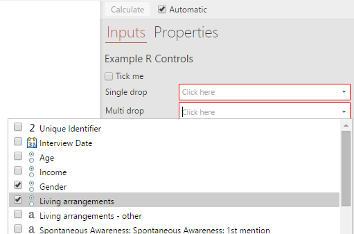
To select objects in a DropBox, click in the DropBox. This will bring up a list of values in your project that can be used in the control. The users will then be able to select one or more of these by ticking the relevant boxes. Clicking anywhere outside of the check-list will close it and the variables will have been added to the DropBox.
Some dropBox controls accept only a single input; others may accept multiple inputs. Normally dropBox controls which only take a single input have a height equal to a single row; multi-valued dropBoxes have greater heights (often 4 rows high). If you select a value in a single-valued dropBox, then it will replace any value which is already there. If you select objects in a multi-valued dropBox, then it will insert the new value into the list. Items may be reordered by dragging them within the control. Depending on what the author of the dropBox has decided, some multi-valued dropBoxes may disallow duplicate values: if you select the same value on the dropBox, then only its position in the list will change. In other cases, a dropBox may allow the same value to reappear in the list more than once.
Removing Values from a DropBox
When you hover the mouse over a multi-valued dropBox, a cross will appear next to the value under your mouse. A Clear button is also available at the bottom of the control.
Pressing on the cross will remove the corresponding value; pressing on the Clear button will remove all values in the control.
If a single-valued dropBox is marked as a required field, there is no way of removing the value once it has been selected. Instead, one may replace it with a new value by selecting the new value in its place. However, if it is not required, then the value may be deleted in the same way as for multi-valued dropBoxes.
Entering data into the Data Entry control
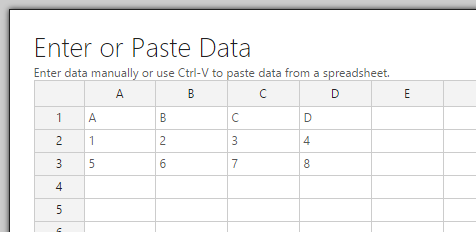
To enter data into the data entry control, the user must first click the Add Data button, enter their data into the spread-sheet layout by typing or pasting, and then click OK.
Execution
Whenever a value has been changed in one of these controls(*), the code which creates these controls is re-run. Why? This is because sometimes the value of one control might necessitate more or fewer inputs. Once this has been re-run, each of the controls are checked to see whether any of the values entered into them are invalid. For example, one control may require only numbers, but perhaps some non-number information has been entered. The most common case of an invalid control is one where information is required, but has not been entered. In any case, messages are displayed next to the invalid controls, and you are given the chance to fix up any issues. Finally, when there are no invalid controls (for example, when all information has been entered), the corresponding R code is run, making use of the inputs you've entered. If you make any changes to any control, then the process is repeated, resulting in the R code being re-run.
(*) When changing a value of a textbox, please note that you should click with the mouse somewhere else on the interface to signal that you have finished entering the text. Otherwise, the textBox will wait patiently for you to continue your typing.
If you would like to see how to create these controls, and how they interface with R code, then read on.
Authoring GUI Controls
The controls are added by including one or more of the following:
- form.checkBox() -- a simple checkbox control,
- form.colorPicker() -- a selector for colors,
- form.comboBox() -- a control which allows the user to pick from a list of alternatives,
- form.listBox() -- a control which allows the user to pick from a list of alternatives and optionally allows multi select,
- form.datePicker() -- a selector for dates,
- form.dropBox() -- a control which will allow the user to drop items from the Object Explorer (found in the "Input Data" page of the Object Inspector),
- form.textBox() -- a control for entering text.
- form.numericUpDown() -- a control for entering a number.
- form.dataEntry() -- a control for entering data manually.
Each of these controls requires a JavaScript object to be passed as an argument; this argument is used to configure the control.
There are other non-input elements which can be added:
- form.setHeading() -- takes a string argument to display a heading above the controls.
- form.setSummary() -- takes a string argument to display some summary text below the controls.
Also, form.setInputControls() may be used to determine which of the input controls gets shown. It takes an array of controls as an argument, and will place each of these controls on the user interface in a left-to-right horizontal flow layout. You may set the parameter lineBreakAfter if you would like to affect the layout. However, mostly you don't need to worry about using form.setInputControls(), nor do you need to worry about lineBreakAfter. If you omit form.setInputControls(), it will automatically layout the controls in a vertical tabular layout (labels on the left, controls on the right), in the order in which the controls were added, which is normally what is desired.
Example
Before diving into the details of how one authors the code, here is an example to get you started:
Control (JavaScript) Code
  form.setHeading("Example R Controls")
  var cb = form.checkBox({label: "Tick me"})
  form.dropBox({label: "Single drop", types:["Question"]})
  form.dropBox({label: "Multi drop", types:["Question", "Variable"], multi:true})
  form.comboBox({label: "Combo", alternatives: ["one", "two", "three"]})
  form.listBox({label: "Single List Box", alternatives: ["one", "two", "three"]});
  form.listBox({label: "Multi List Box", alternatives: ["one", "two", "three"], multiSelection: true});
  form.numericUpDown({label: "Up down"})
  form.textBox({label: "Text"})
  form.colorPicker({label: "Colours"})
  form.datePicker({label: "Date"})
  if (cb.getValue())
    form.setSummary("Checked and ready to go.")
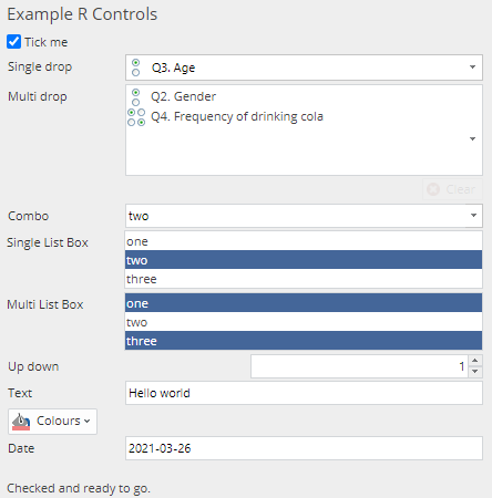
It produces the controls as shown below, and which have since been filled in:
Note that the summary message ("Checked and ready to go.") appears at the bottom of the screen because the Tick me checkBox has been checked.
Paired R Code
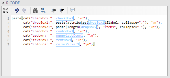
When such JavaScript code runs, it produces controls which appear on the user interface. It also makes available variables which may be accessed from R, corresponding to each of these elements. Here is some sample R code which shows how the various controls are named and how they are highlighted (displayed in light blue boxes). In this case, as none of the controls have been explicitly named, they are automatically given names (as described below).
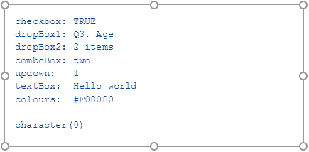
When this code is run, it produces the output as shown:
Parameter Value Substitution
By default, parameter values are supplied to the R code by prepending variables to the code. A variable is created for each control and R code is generated for assigning the control values to the variables as can be seen in the preceding example. The code for parameter assignment is generated whenever the code is executed.
In addition to parameter assignments, you may use special functions for substituting control values into the R code. The following example shows a wiki template that uses substitution functions.
NOTE: Prior to Q5.10, only authors of Standard R wiki pages could use the substitution functions. Substitution functions were applied whenever the values of the controls were modified by the user, so the user would see the substituted values when the view the code, but this is no longer the case.
form.setHeading("Ordered Logit")
form.dropBox({label: "Outcome",
            types:["Variable: Numeric, Date/Time, Money, Categorical, OrderedCategorical"],
            name: "formOutcomeVariable"})
form.dropBox({label: "Predictor(s)",
            types:["Variable: Numeric, Date/Time, Money, Categorical, OrderedCategorical"],
            name: "formPredictorVariables",
            multi:true})
library(flipMultivariates)
data <- QDataFrame(formOutcomeVariable, formPredictorVariables)
ordered.logit <- OrderedLogit(QFormula(formOutcomeVariable ~ formPredictorVariables), data, QCalibratedWeight, QFilter)
Before the R code is executed, the function calls QDataFrame(formOutcomeVariable, formPredictorVariables) and QFormula(formOutcomeVariable ~ formPredictorVariables) are replaced with parameter values and R function calls. Names are generated for labeling variables and inserted into formulas as required.
library(flipMultivariates)
data <- data.frame(Q27.Weightconsciousness = Q27, Q28.Exercise.frequency = Q28, Q29.Living.arrangements = Q29)
ordered.logit <- OrderedLogit(Q27.Weightconsciousness~Q28.Exercise.frequency+Q29.Living.arrangements, data, QCalibratedWeight, QFilter)
Editing Standard R Items
Prior to Q5.10, R code from Standard R wiki templates could not be edited by users of Q or Displayr. If the user edited the code in Q or on Displayr, the template was discarded and substitutions would no longer be performed.
As of Q5.10, it is safe for users to modify R code from Standard R wiki templates, however care should be taken around the substitution functions.
Details
Expression
The textBox, comboBox and dropBox have values which may be represented as strings. Sometimes, one wants these values to be used in R as strings, sometimes as values. For example, you might want a user to be able to type a range 1:10 into a textBox and have this able to be used as an expression in R; other times one might want the user to be able to type Male, but for it to be interpreted as the string "Male". For this reason, there is an expression parameter which determines the way in which the value is passed to R: if expression is true, then it will be passed to R unadorned so that it will get interpreted as an expression, otherwise it will be quoted, so interpreted as a string. In most cases, textBox and comboBox want to pass their values as strings, so expression defaults to false; for dropBox, we are mostly concerned with the value of the Variable, Question or whatever that the user has dragged in (rather than a string representing the name of that object), so for dropBox, expression defaults to true.
DropBox Multi
DropBox controls come in two flavours, corresponding to whether multi is set to true or false. dropBox({multi:false, ...}) will produce a single-entry dropBox control. This single-entry control will only allow one thing to be dropped on it; further drops will replace earlier ones. Only if required is false, will it be possible to remove a value from a single-entry dropBox control. It also means that the value passed to R is a single object.
On the other hand, dropBox({multi:true, ...}) will produce a multi-entry dropBox control. More than one value may be dropped on it either at once or subsequently, leaving earlier values. The order of the values matters, and the parameter duplicates controls whether the same value may appear in the dropBox more than once, or whether dropping it again will just affect the ordering. Values may be individually removed, or all the values may be removed together. In any case, the value passed to R is a list of objects (even if there is only one value which has been dropped in the box by the user).
There are further parameters specific to dropBox controls: see below.
DropBox Types
As mentioned earlier, dropBox controls may place restrictions on the sort of inputs they accept. This information is specified using the types parameter when constructing a dropBox control. DropBox types are defined as an array of strings consisting of:
- Variable,
- Question,
- VariableSet (Displayr),
- Table
- RItem or
- Control
These types may be further restricted to their respective subtypes by adding a comma-separated list of these subtypes (the subtypes in the comma-separated list are OR-ed together, that is, they are all allowed). For example, Variable is restricted to the union of Numeric, Categorical and Ordered Categorical subtypes in the following example:
form.dropBox({label: "Categorical or Numeric Variables:", types: ["Variable:Numeric,Categorical,Ordered Categorical"]})
These types may be further restricted to those which are tagged as hidden, a filter or a weight, by adding the corresponding restrictions. Prefixing a restriction with "!", negates the restriction. So, for example, "Variable:!hidden" will accept all non-hidden variables and "Question:filter,!weight" will accept either any question which is a filter or any question which is not a weight.
Note also that the strings representing these types try to be quite tolerant: they are case-insensitive, and don't care about spaces. The primary types may even be abbreviated so any prefix of "Variables", "Questions" and "RItems" is acceptable. Some examples:
| types: ["V:numeric:!filter"] | Any Numeric Variable which is not a filter |
| types: ["Quest: Pick One", "Var: Categorical, OrderedCategorical"] | Any Pick One Question or any Categorical or Ordered Categorical Variable |
| types: ["VariableSet: OrdinalMulti"] | Any Pick One - Multi Question with all Ordered Categorical Variable. (This concept is from Displayr.) |
| types: ["q:!hidden:filter", "R"] | Any filter Question which is not hidden or any R item |
| types: ["questions:!experiment:!ranking"] | Any Question which neither an experiment nor a ranking |
| types: ["RItem:matrix"] | Any R Output whose object has a class of "matrix". |
| types: ["Control:date"] | Any Date Control in the document. |
| types: ["Control:date,listbox,combobox,textbox"] | Any Date Control, List Control, Combo Box, and Text Input in the document. |
This specification of types may also be used as a way of populating the pop-up list in a comboBox. You can get a complete list of valid types by specifying any invalid name, and then looking at the error message.
Names Shown for Variables and Questions
Where a variable is shown in a drop box, the name used depends on whether it is part of a multiple-variable question or not. For single-variable questions, the question name is shown. For multiple-variable questions, the question name and the variable name are shown, separated by a colon.
Parameter Reference
All parameters are optional. Standard parameters for each of these controls are as follows:
- label -- A label which appears adjacent to the control (a string). Default: none.
- name -- The name of the control (a string). Default: automatically created based on the control type.
- default_value -- The value used if the user does not enter anything.
- prompt -- The text (an html string) for the placeholder and the tooltip. Default: none.
If name is given, it is the name which is passed to the R code. If no name is given, then one is created based on the type, for example, the first comboBox will be called "comboBox1", and the second will be called "comboBox2", etc; the first checkBox will be called "checkBox1".
CheckBox
There are no special parameters for checkBox() controls.
ColorPicker
There are no special parameters for colorPicker() controls.
ComboBox
The special parameters for comboBox() controls are as follows:
- alternatives -- An array of strings to show in the drop down.
- types -- A list of allowed values (an array of strings). (See the description of DropBox Types above.)
- required -- A flag indicating whether an input is required in order to be valid. Default: true.
- expression -- Whether the output of this is to be treated as an expression, or requires quoting. Default: false.
- prompt -- Same as for the standard parameters, but default: determined from "types".
- error -- The text (an html string) to be displayed if an unacceptable input is being dragged into the dropBox. Default: determined from "types".
- invalid -- The text (an html string) indicating that the input is invalid. Default: "".
If a types is specified, then it is used to populate all the alternatives that appear in the drop-down of the comboBox. Otherwise, alternatives must be specified, and will be responsible for the list which appears in the drop-down.
ListBox
The special parameters for listBox() controls are as follows:
- alternatives -- An array of strings to show in the list box.
- names -- An array of strings corresponding to the alternatives which should be used as the actual output to R.
- multiSelection -- A flag to indicate whether the control can accept more than one input. Default: false.
- nItemsVisible -- The maximum height of the control (in lines). Default: 5.
- initialValues -- A list of values corresponding to names if present or alternatives that is used to preset the selection. default: none.
- required -- A flag indicating whether an input is required in order to be valid. Default: true.
- error -- The text (an html string) to be displayed if the control is required and not entered. Default: "[Label] is required.".
If both alternatives and names are specified they should be the same length.
DatePicker
There are no special parameters for datePicker() controls.
DropBox
The special parameters for dropBox() controls are as follows:
- types -- A list of allowed values (an array of strings). These may be 'Variable', 'Question', 'VariableSet' (Displayr), 'Table', 'RItem', or 'Control'. See DropBox Types for more information.
- multi -- A flag to indicate whether the control can accept more than one input. Default: false.
- required -- A flag indicating whether an input is required in order to be valid. Default: true.
- expression -- Whether the output of this is to be treated as an expression, or requires quoting. Default: true.
- prompt -- Same as for the standard parameters, but default: determined from "types".
- error -- The text (an html string) to be displayed if an unacceptable input is being dragged into the dropBox. Default: determined from "types".
- invalid -- The text (an html string) indicating that the input is invalid. Default: "".
The following parameters only make sense when multi is true.
- min_inputs -- The minimum number of inputs required. Default: if "required" then 1 otherwise 0.
- max_inputs -- The maximum number of inputs allowed. Default: no maximum.
- height -- The vertical size of the dropBox (in lines). Default: min(max_inputs, 4).
- duplicates -- A flag indicating whether the control permits the same input to appear twice. Default: false.
TextBox
There special parameters for textBox() controls are as follows:
- type -- The name of the type used to validate the text (either "number" or "text"). Default: no validation.
- required -- A flag indicating whether an input is required in order to be valid. Default: true.
- expression -- Whether the output of this is to be treated as an expression, or requires quoting. Default: false.
- prompt -- Same as for the standard parameters, but default: based on "type".
- error -- The text (an html string) to be displayed if an unacceptable input is given. Default: based on "type".
- invalid -- The text (an html string) indicating that the input is invalid. Default: "".
NumericUpDown
The special parameters for numericUpDown() controls are as follows:
- increment -- The amount by which the number is raised or lowered when the up and down arrow buttons are pressed. Default is 1.
- minimum -- The minimum value for this number. Default is 0.
- maximum -- The maximum value for this number. Default is 100.
DataEntry
- label -- Text shown inside button. Default: "Add Data...".
- edit_label -- Text shown inside button when data has been added. Default: "Edit Data...".
- default_value -- A string matrix of values to prepopulate the data. Default: None.
- required -- A flag indicating whether an input is required in order to be valid, also adds red styling to the button when empty. Default: true.
- prompt -- The text (an html string) for the tooltip. Default: none.
Note that getValue() returns an array or arrays. It is initially set to null (which has no length), but if the user clicks into the data entry sheet and then does not enter anything, or deletes all the existing values, you need to check that getValue().length == 0.
Substitution Function Reference
QDataFrame
QDataFrame(parameter1, parameter2, ..., parameterN) — is replaced by data.frame(label1 = variable1, label2 = variable2, ..., labelN = variableN) where variable1, variable2, ..., variableN are the values supplied by the user for controls named "parameter1", "parameter2", ..., "parameterN" respectively and label1, label2, ..., labelN are automatically generated labels. If a parameter has multiple values, the values will be inserted separated by commas. As QDataFrame(...) gets transformed to a data.frame(...), parameters for date.frame can be passed in too (i.e. check.names = FALSE).
Note: Since questions are not directly suitable as inputs to data.frame, parameter values for QDataFrame would typically be restricted to variables. This does not prevent users from selecting questions because questions will automatically be replaced by their constituent variables when dropped onto controls that only accept variables.
QFormula
QFormula(parameter1 ~ parameter2 + ... + parameterN) — is replaced by a formula label1 ~ label2 + ... + labelN) where label1, label2, ..., labelN are the same labels as substituted into the QDataFrame substitution function.
QInputs
QInputs(parameter1, parameter2, ..., parameterN) — is replaced by value1, value2, ..., valueN) where value1, value2, ..., valueN are the values supplied by the user for controls named "parameter1", "parameter2", ..., "parameterN" respectively. If a parameter has multiple values, the values will be inserted separated by commas.
Note: Since QInputs does not surround multiple values with brackets, care must be taken when multiple values are allowed to ensure that the generated code makes sense for more than one value.
Organizing Controls with Groups and Pages
When many controls are required on the Inputs tab of the Object Inspector it is preferable to organize these controls into groups or separate pages rather than presenting the user with a long list. The following commands achieve this.
- form.group('Group name') -- creates a new group, into which all following controls are added. Users may contract a group to hide its controls, or expand a contracted group to reveal the controls.
This can also be more completely called:
- form.group({label: 'Group name', expanded: true }) -- does as above but explicitly sets its state be expanded in the object inspector rather than relying on Displayr's heuristic (a null value will rely on Displayr's heuristic)
- form.page('Page name') -- creates a new page, into which all following controls are added.
Note that older versions of Q before 5.1.2 do not support groups and pages. In this situation it is necessary to limit the appearance with if (Q.fileFormatVersion() > 10.9). The mapping between Q version and file format version can be found here.
The following is an example of groups and pages.
  form.setHeading("Example Groups and Pages")
  form.checkBox({label: "Control outside group."})
  form.group("Create new group A");
  form.dropBox({label: "Control in group A", types:["Question"]})
  form.dropBox({label: "Another control in group A", types:["Question", "Variable"], multi:true})
  form.group("Create new group B");
  form.comboBox({label: "Control in group B", alternatives: ["one", "two", "three"]})
  form.page("New page Z");
  form.numericUpDown({label: "Control on page Z"})
  form.group("Create new group C");
  form.textBox({label: "Control in group C on page Z"})
Creating Conditional Controls
In some cases, GUI controls may only be relevant to the user if the user has specified a particular option higher up in the form. Controls which are not relevant to the current selections may then be hidden from view so as to not make an unnecessarily large or confusing form. For example, you may have a drop box which choose from several versions of regression methods, and depending on the user's selection in this box you may need to get the to specify other options or parameters which are relevant to the regression that they have selected and which are not relevant to other regressions.
The approach is to use if statements and other logic in the JavaScript form code which control the presence or absence of controls, and for the corresponding R code to anticipate the presence or absence of the parameter.
Important:
- It is not possible to interrogate variables, questions, tables, or R outputs selected in the form. The form is not capable of making decisions based on the type of input (e.g. Variable Type) of a Q object selected in a drop box.
- It is not possible to refer to optional controls using substitution functions, like QInputs().
To achieve this in a form:
- The control whose value determines whether or not other options are shown must be declared explicitly as a JavaScript variable in the form code (i.e. with var).
- The getValue() method is used to obtain the currently-selected value of the control where only a single selection is possible, and getValues(), which returns an array, when multiple selections are possible.
- Place the lines which create optional controls within an if statement whose condition looks at the value obtained in the previous step.
When a GUI control is not shown on the form then it does not exist and it does not provide any value to R. As a result, the corresponding R code must be written in such a way as to never attempt to obtain the value of the control when the control does not exist, as this will generate an error and prevent the item from running. You can still refer to the name of the name of the control but your code must never try to evaluate it.
Examples
Here we illustrate good and bad examples of how to use conditional controls. The JavaScript GUI code is defined first:
var my_option = form.comboBox({name: "combo1", label: "Choose an option:", alternatives:["Option 1", "Option 2"]});
if (my_option.getValue() == "Option 2") {
    form.checkBox({name: "check1", label: "Check me", default: false});
}
The first control is a combo box. The second control, a check box, is only shown when the user selects Option 2.
Next we consider two examples of corresponding R code, the first which is correct and runs properly, and the second which illustrates incorrect usage of the conditional paramters.
Good R Code:
In the first example we create a function called my_fun which has two arguments. The function checks the first argument (which corresponds to the combo box), and if it has the value "Option 2" it then looks at the value of the second argument (which corresponds to the check box) and prints out this value. If the first argument is not "Option 2", then the function never looks at the value of its second argument and provides a friendly greeting.
my_fun <- function (x, y) {
    if (x == "Option 2") {
        print(y)
    } else {
        print("Hello!")
    }
}

my_fun(combo1, check1)
Alternatively, we can also use the R function exists to check a variable before using it. For example:
result <- if (exists("check1")) check1
          else FALSE
print(result)
See Visualization - Area Chart for a more complicated example.
Bad R Code:
In this example, we have a function my_fun, but this time the function tries to evaluate the value of its second argument (the check box) regardless of whether or not the first argument (combo box) is set to "Option 2". When the combo box is not set to "Option 2", the check box does not exist, and so when the function in our R code tries to evaluate its value, there is an error and the code fails to run.
my_fun <- function (x, y) {
    if (x == "Option 2") {
        print(y)
    } else {
        print(y)
        print("Hello!")
    }
}

my_fun(combo1, check1)
For a more complicated form, see Dimension Reduction - Principal Components Analysis, which allows the user to select extra parameters depending on which rotation they use, and to select different options depending on the display option they choose.
