How to Create a Time Series Plot Using Different Data Sources
| Related Online Training modules | |
|---|---|
| Multiple Data Files in a Q Project | |
| Generally it is best to access online training from within Q by selecting Help > Online Training |
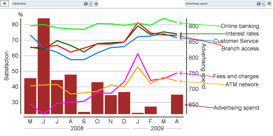
Often it is useful to create time series plots using multiple data sources (e.g., overlaying advertising spend on a tracking with advertising or sales records. For example, we might want to create a time series chart which displays satisfaction by advertising spend, as in the example below.
There are three different ways of doing this.
Multiple data files
The most general solution is to use Multiple Data Files.
Recoding
Create a new variable that shows, for each respondent, the values of interest for a specific time period. For example, if wanting to add weekly advertising spend, we need to create a new variable that shows for each respondent the weekly advertising spend in the week that they were interviewed; if the spend for the week commencing 3 January was $140,000, then a value of $140,000 needs to be assigned to each respondent interviewed in that week. There are lots of ways of doing this, but the most straightforward is to:
- Create or find a variable that has a unique value for each week (e.g., 1 for the first week of tracking, 2 for the second week of tracking, etc.). Generally, it is best if this week is created by whoever created the data file, as sometimes the actual dates of interviewing do not coincide with the dates of reporting.
- Take a copy of this variable (in the Variables and Questions tab).
- Recode the values of the variable, replacing the value of each week with the advertising expenditure for that week (e.g., replacing the value of 1 for week 1 with the value of 140000 if that is the advertising expenditure of the week).
- Change the Question Type to Number (unless it is already this type).
- Give the question an appropriate name (e.g., Weekly ad spend).
- Create a time series chart of the question of interest (e.g., advertising awareness).
In the Blue Drop-down Menu to the right of the chart, select the new variable.
Merging or pasting variables
When there is a large amount of data to be overlaid (e.g., spend by lots of different media channels), it may be faster to export the variable containing the weeks into Excel, create new variables in Excel and then merge the data in (either by inserting or merging variables).
